What does it do?
Curates residential homes, supports viewings and helps buyers and sellers move through a clearer property journey.

A real estate brand with a clear point of view—and a visual system that carries it everywhere.
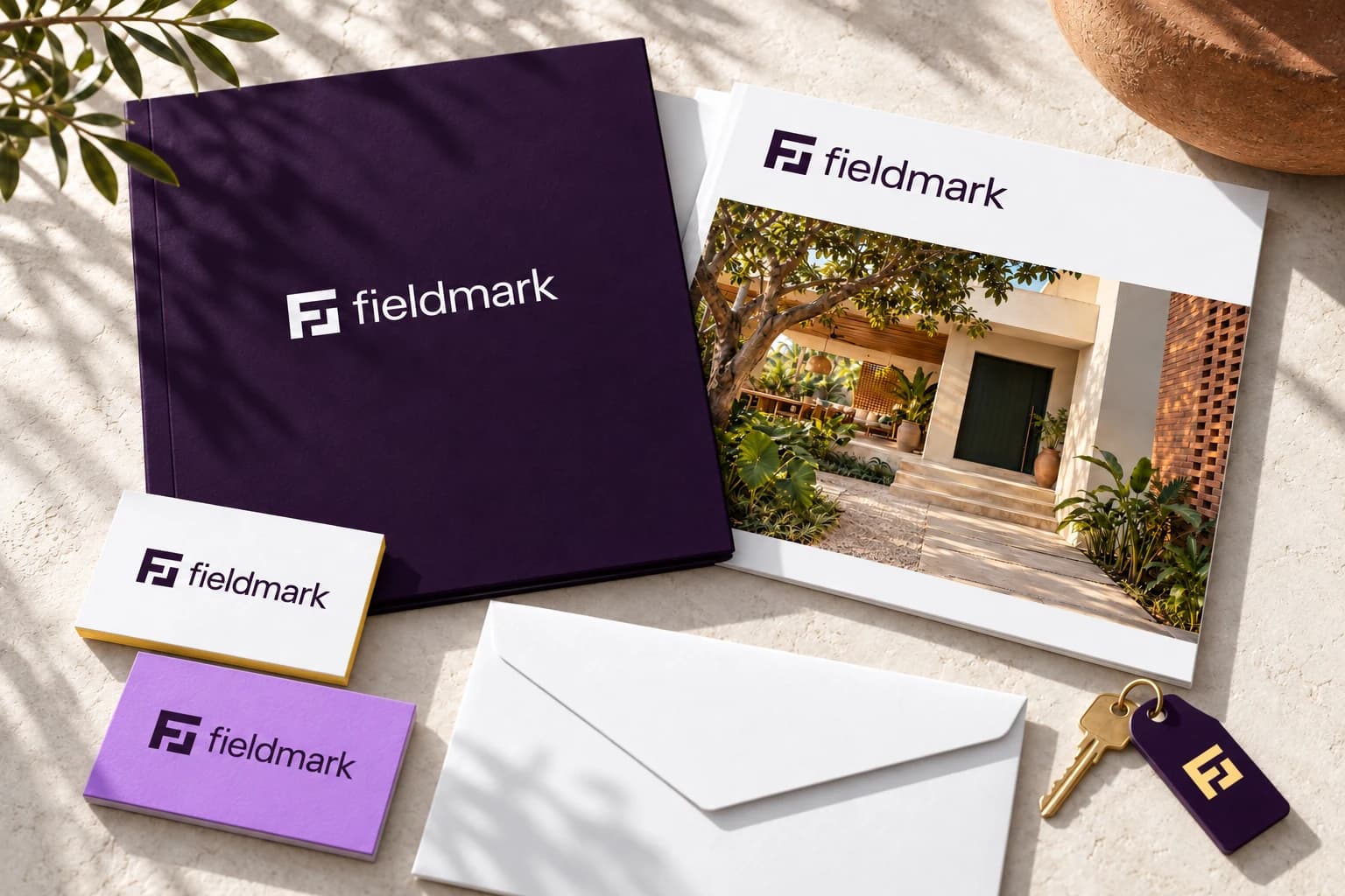
The design challenge was to make a residential real estate company recognisable while communicating something useful: thoughtful homes, clear information and a confident next step.
For Fieldmark, we set a concept brief around the questions a brand must answer before its logo is drawn: what it offers, who it serves, why it matters and how people should perceive it.
This is an original concept, not a commissioned rebrand. Discovery answers are working assumptions; no client interviews, competitor audit or business results are claimed.
Curates residential homes, supports viewings and helps buyers and sellers move through a clearer property journey.
People choosing their next home, returning buyers and owners who value considered spaces and straightforward information.
A home is both an everyday place and a major decision. Useful details and an honest sense of the space help people take the next step.
Human, grounded, confident and considered. Care in selection and clarity in communication, without unnecessary showmanship.
Fieldmark brings thoughtfully selected homes and clear property information into one calm, human experience. That positioning connects the offer with the decisions people actually need help making.
Field suggests land, possibility and a place to begin. Mark suggests recognition, intention and a point of view.
The brand line—“Good homes. Clear decisions.”—turns those ideas into a concise promise. The personality stays human, grounded, confident and considered.
Before refining the identity, we explored different ways a property business could show up. Each direction connected typography, imagery and colour with a different personality.
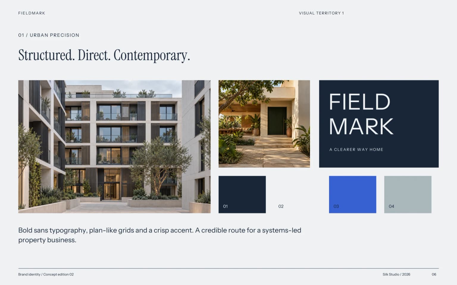
Structured, direct and contemporary. A crisp, systems-led direction.
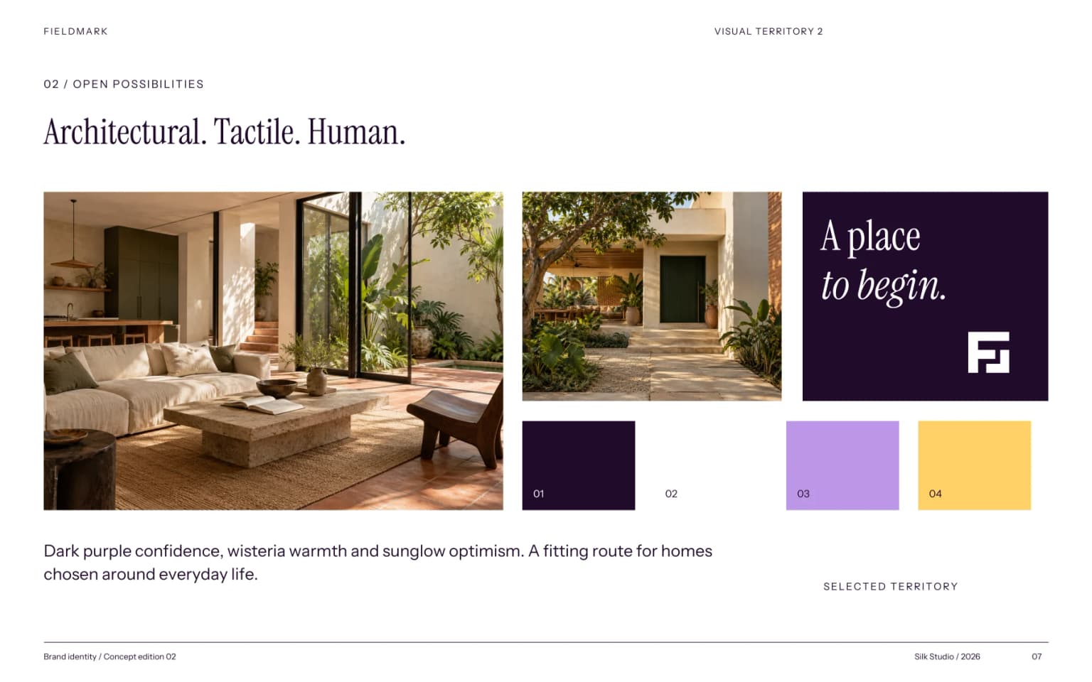
Architectural and human. The selected territory pairs purple confidence with warm imagery.
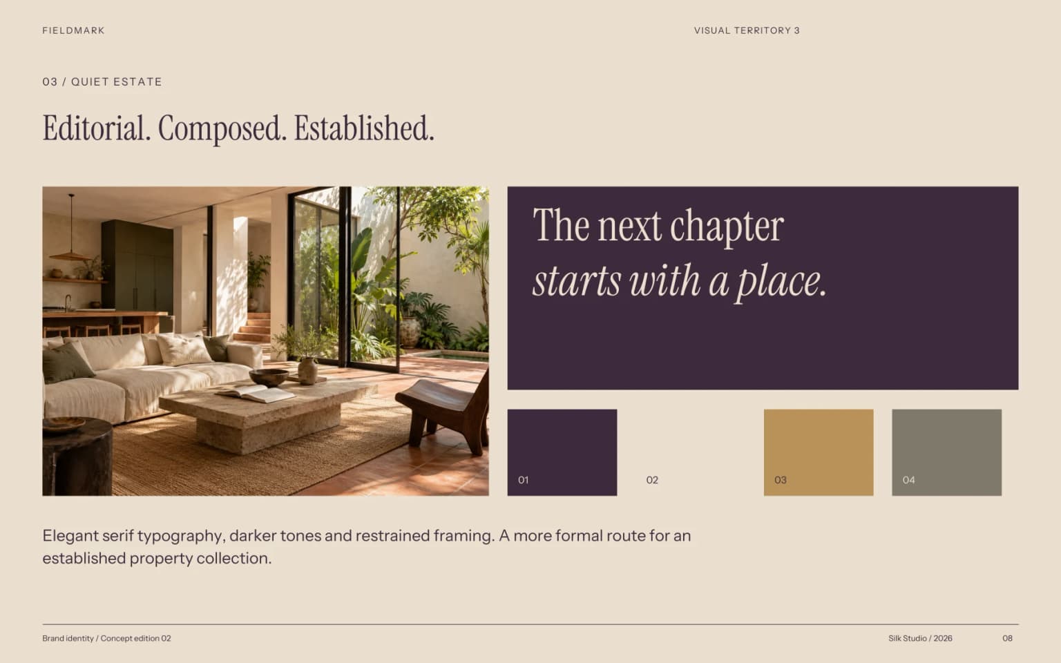
Editorial and established. A more formal, heritage-led alternative.
Common Ground emphasised community; Morrow & Land suggested optimism. Fieldmark was selected for its architectural character and its connection to place, recognition and intention. It is a proposed concept name.
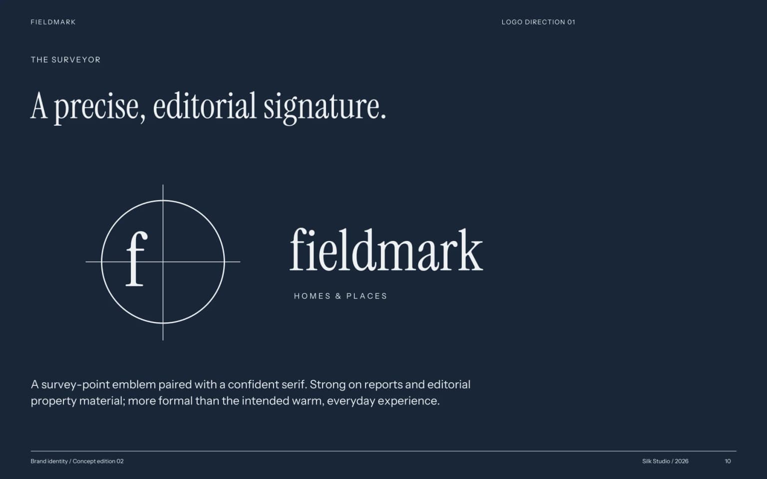
Precise and editorial, but more formal than the everyday experience the brief called for.

A compact F and an open boundary. Recognisable as a signature, flexible enough to become a wider graphic system.
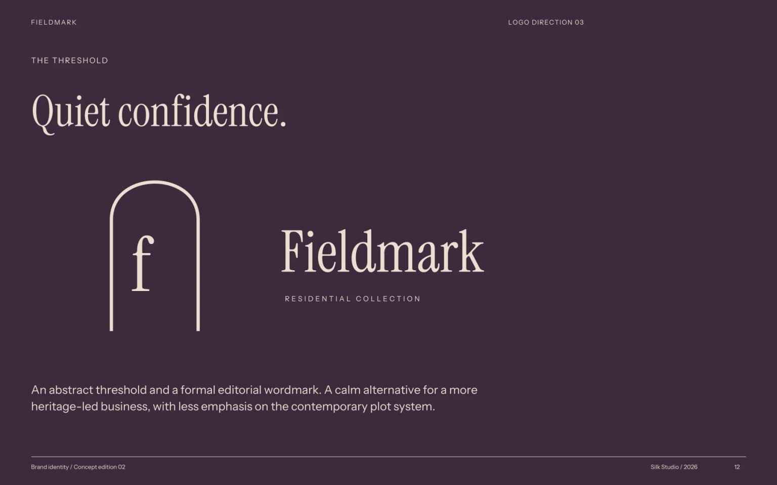
A calm doorway and formal wordmark, with less connection to the contemporary plot system.
The upper F and lower corner form an open footprint. The gaps become entry points, linking the initial to a place you can enter. A lowercase wordmark keeps the geometric symbol approachable.
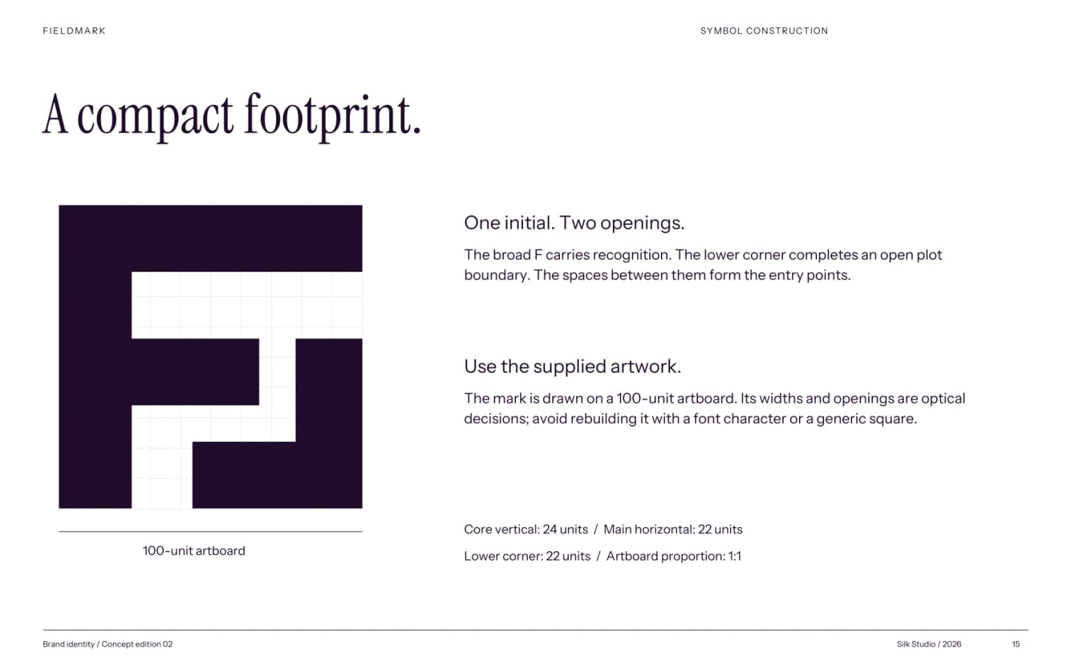
The F remains legible as an initial, while the open boundary gives it its own character.
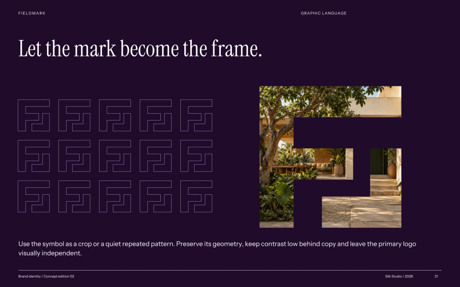
The geometry extends into crops, frames and repeated patterns across property material.
Clear space is one quarter of the symbol’s height. Minimum sizes: 24 px symbol / 144 px signature; 8 mm / 38 mm in print. No stretching, rotation or added effects.
Dark purple anchors the identity. Wisteria creates expressive secondary fields; sunglow draws attention to a next step. White gives photography and information room to breathe.
#210B2C#BC96E6#FFD166#FFFFFFDark purple on white provides 18.3:1 contrast. Small text stays dark on wisteria and sunglow. Print colour conversions require proofing with the chosen stock and press.
A home with a
little more life.
Short expressive headlines. Generous scale and close, deliberate leading.
Clear details.
Useful guidance.
A calm sans serif for navigation, descriptions and property facts. Both families are supplied under the SIL Open Font License.
A six-column foundation, generous margins and an eight-point spacing rhythm hold the layouts together. Natural light, tactile materials and human-scale architectural details communicate how a home might feel.
Direct, considered and human. “A quieter way home” sets the campaign mood; practical descriptions explain the space. Calls to action stay clear: Explore homes. Arrange a viewing. Ask a question.
The same signature, colours and hierarchy carry from a first impression to useful property information. Applications test whether the idea can work as a complete identity.
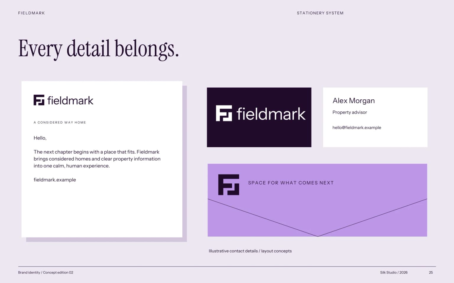
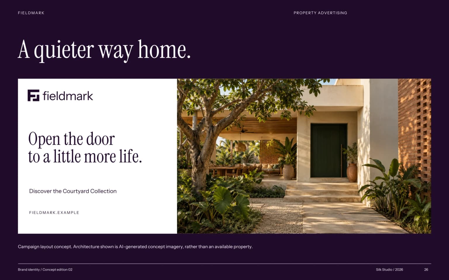
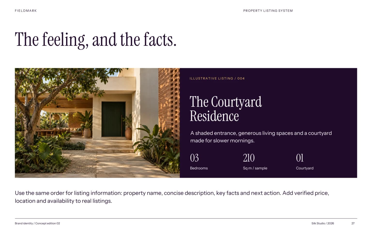
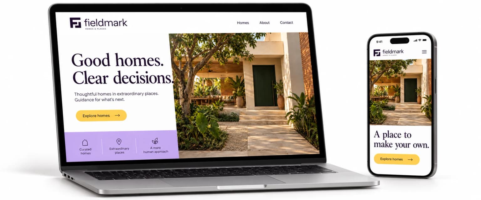
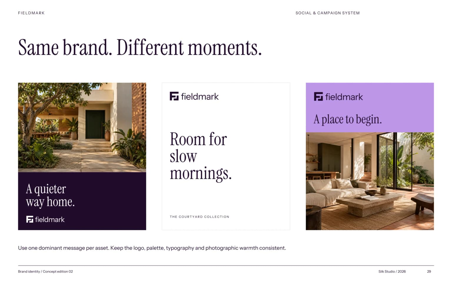
A complete concept identity: strategy, naming, primary signature and symbol, colour system, typography, layout, graphic language, photography direction, voice and applications. The 30-page guide records the decisions and the rules for using them.
The handover includes vector SVG and PDF artwork, transparent PNG variants and colour values. The next step for a real business would be validating the proposition and name, confirming actual property information and preparing production files.
View the full brand guideSelf-initiated concept by Silk Studio. Property imagery and product scenes are AI-generated presentation assets. The digital screens are design concepts. No sales, conversion or client results are claimed.
Bring the business, the audience and the goal. We’ll shape the identity around them.
Start a brand project